Warning: count(): Parameter must be an array or an object that implements Countable in /home/netprofitsexpert/public_html/wp-content/themes/newstar111/views/author_reviews.php on line 10
As an investor and a technical analyst, there are numerous tools available for you on StockCharts that you can use to find tradable opportunities.
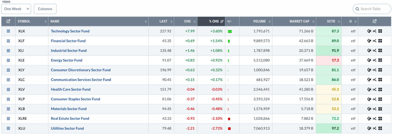
One idea is to begin with a survey of top-performing sectors. It’s Wednesday morning; the Dow jumped 400 points, the S&P 500 ($SPX) hit a record high, and technology stocks spearhead the rally. To begin, under the Charts & Tools tab on Your Dashboard, select Sector Summary (under Research Tools).
If you switch from the default Intraday setting to One Week, you’ll see that the Technology sector is leading the pack.
FIGURE 1. ONE WEEK SECTOR SUMMARY. The Technology sector is in the top position.Image source: StockCharts.com. For educational purposes.
It’s interesting that tech also held the top spot for the last month. Now, let’s zoom in on the industry level by clicking “Technology Sector Fund.” Semiconductors are on top.
FIGURE 2. ONE WEEK INDUSTRY SUMMARY. Semiconductors lead the pack at the industry level.Image source: StockCharts.com. For educational purposes.
Looking at this information, it makes sense to identify exchange-traded funds (ETFs) that follow Tech or semiconductor stocks.
To begin your analysis, let’s compare three charts (one that represents the sector, another that represents the industry, and one that focuses on stocks within the industry. We’ll use the Technology Select Sector SPDR Fund (XLK), Dow Jones US Semiconductors Index ($DJUSSC), and VanEck Vectors Semiconductor ETF (SMH).
Tech Sector, Semiconductor Industry, and Semiconductor ETF
FIGURE 3. ACP COMPARISON DAILY CHART OF XLK, $DJUSSC, AND SMH. They look identical, but are they?Chart source: StockChartsACP. For educational purposes.
The charts are nearly identical, which makes sense as chip stocks were a significant driver in tech. Given the similarity in performance, perhaps XLK provides a more diversified alternative to concentrating on the semiconductor industry. Let’s take a look at XLK’s daily chart.
FIGURE 4. DAILY CHART OF XLK. A rising smaller trend within a larger swing outlines a wide range of support and resistance.Chart source: StockCharts.com. For educational purposes.
Looking at the broader tech proxy, XLK, you can see a smaller rising trend within a large swing that outlines a wide range of support and resistance. Drawing a Quadrant Line from the bottom to the top, you can gauge where this trend is relative to the intermediate-term highs and lows. For the trend to continue, price has to break above the Quadrant Line at $237.50, while staying preferably above the bottom quadrant (see blue arrow), where it last bounced, at $202.50.
The High-Low Percent breadth indicator above the chart shows modest bullishness, as the number of 52-week highs outnumber 52-week lows, giving you a slightly bullish reading of 15.38%.
Look at the relative performance between XLK and $DJUSCC in the panel below the chart (comparing the sector to the industry). The sector has been underperforming the semiconductor industry since December 2023 (see zero line) and is currently at -32.79%.
Perhaps a semiconductor ETF might be the way to go. But which one? You have a choice of the following:
VanEck Vectors Semiconductor ETF (SMH), which is the most liquid
iShares Semiconductor ETF (SOXX), another popular ETF, and
SPDR S&P Semiconductor ETF (XSD), the smallest of them all by market cap.
Let’s compare their performance to $DJUSSC using StockCharts PerfChart.
FIGURE 5. PERFCHART OF $DJUSSC, SMH, SOXX, SXD. There’s a huge difference in performance between the four.Image source: StockCharts.com. For educational purposes.
All three ETFs are tightly correlated to $DJUSSC, but their relative performances are worlds apart. The best-performing ETF is SMH, which happens to be the most liquid and largest by market cap.
Let’s switch to a daily chart of SMH. In the panel above the chart, you’ll notice the sideways-moving On Balance Volume, indicating that buying/selling pressure is virtually at a standstill as if the asset is waiting for something. What might that be? Notice how the last move down from the July high to the August low corresponds with heavy selling pressure, as shown by the Chaikin Money Flow (CMF). Also, notice how the CMF is trending up.
FIGURE 6. DAILY CHART OF SMH. The first top quadrant is one to watch closely.Chart source: StockCharts.com. For educational purposes.
It makes you wonder how many traders were short SMH or how many just dumped their shares. If some are still short, where will they close to avoid a squeeze? It will likely be close to the first quadrant, which, for the bears, would break the 75% line if you’re measuring from the top down (magenta circle).
Bullish traders jumped in at the bounce near the bottom, and the real action is likely in the top quadrant. That’s where we’ll see if the trend continues (it would need to break resistance at $281.70) or if things go sideways until a major catalyst shakes it up and out of its range.
At the Close
When deciding what stock or ETF to trade, start with the big picture by looking at top-performing sectors. Then, zoom in on the industries driving them. In this case, tech stocks lead the way, with semiconductors at the forefront. Despite their visual similarities in performance, each asset showed different relative performance, especially between the $DJUSSC index and the three semiconductor ETFs that were nearly 100% correlated with it.
Disclaimer: This blog is for educational purposes only and should not be construed as financial advice. The ideas and strategies should never be used without first assessing your own personal and financial situation or without consulting a financial professional.


